What I wish I knew sooner about book covers
- peh61hall
- Jul 17, 2025
- 3 min read
When I started out on this journey to become an author, there was one piece of advice that kept re-occurring, “No matter what else you do, get a professional to create your front cover - it’s too important to muck up.” And it’s not just all the out of work cover designers saying that every book needs a proper cover. It’s almost every marketing expert too – and there’s a huge bundle of them!
Arguably the first cover of a potential series is even more important as it sets the tone for the brand. At the time I wasn’t sure I would write a series, so didn’t give it much thought. In fact, most of the decisions I have made on this journey have been guided by gutfeel.
As it happens it’s the one piece of advice I’ve followed and not regretted, not even for a moment. There have been instances when I’ve been standing outside my favourite bookstore in East Grinstead harassing passers-by to buy my latest offering. The occasional bored shopper will stop, pick up a book, turn it over in her hand and then say, “nice cover,” before returning the book to the table and scuttling away quickly.
When writing a book there are a few milestones in the process; the first sentence, the last sentence, getting back the first review from a Beta-reader, pressing the ‘publish’ button on Amazon and receiving the first creative suggestions back from your cover designer about a week after you’ve sent over the brief. I experienced that a few days ago with my latest book (probably launching in mid-June) and thought it would make a good topic for a blog.
I feel I should begin with a vote of thanks for my cover designer, a gentleman from Brighton by the name of Patrick Knowles. Patrick is an experienced calligrapher and cover designer having worked with Game of Thrones author George R.R. Martin and Anthony Horowitz before hitting the big-time with yours truly!
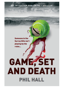
Below are a series of cover ideas, developed by Patrick for my first Inspector Bee crime thriller, Game, Set and Death. Unsurprisingly the idea of a tennis racquet or a tennis court features strongly in the early designs, as does the idea of a dark detective with a pork-pie hat..
Looking at each of these it makes me wonder how we ever came to arrive at the final option, but as I recall it was a fairly fast process. The first step was to agree on some principles; a black and white image with a single colour contrast., my name in white block letters along the bottom. Together with a smaller, secondary image connected to the main theme but in some way broken.
We experimented with holes and faces on the racquet but ultimately chose a bent racquet which was perhaps a little too subtle for its own good. However, these principles have severed us well over the last four years.
Here is the final image, which hopefully, you are all familiar with!
Today’s musical accompaniment is Hunky Dory by David Bowie. It was his 4th studio album released in 1971 and as I recall the first LP I ever bought. It was a more melodic piano based set of songs, written in contrast to his earlier guitar led material which probably accounts for my interest having been brought up on my mother’s collection of Beatles and Cilla Black. In general, the album reflects Bowie’s newfound enthusiasm for America – the album is littered with American references.


Comments